Responsive modular grid layouts for Elm.
Designed for elm-ui and elm-land, but can be useful with elm-css or even pure CSS too.
A modular grid is a well-known design approach that helps to establish a visual rhythm and produce layout designs quickly and in a controlled way. A simple explanation is given Design Trampoline. Module 5: Grid, and more info can be found on the web.
In the code, we refer to the following elements of the grid:

The full potential of modular grid design will be realized if the layouts are designed in Figma or another similar tool before coding. But this is optional.
- Responsive grid columns (step width is variable, columns can grow, but gutter and minimal margin are fixed).
- Allows to establish a vertical rhythm using column width, and maintain proportions of the grid elements on different screen sizes.
elm install elm/browserexport const flags = ({ env }) => {
return {
windowSize: {
height: window.innerHeight,
width: window.innerWidth,
},
};
};import GridLayout2
type alias Model =
{ layout : GridLayout2.LayoutState
}
import GridLayout2

type Msg
= GotNewWindowSize GridLayout2.WindowSizeimport GridLayout2
type alias Flags =
{ windowSize : GridLayout2.WindowSize }
decoder : Json.Decode.Decoder Flags
decoder =
Json.Decode.map Flags
(Json.Decode.field "windowSize" GridLayout2.windowSizeDecoder)
layoutConfig : GridLayout2.LayoutConfig
layoutConfig =
{ mobileScreen =
{ minGridWidth = 360
, maxGridWidth = Just 720
, columnCount = 6
, gutter = 16
, margin = GridLayout2.SameAsGutter
}
, desktopScreen =
{ minGridWidth = 1024
, maxGridWidth = Just 1440
, columnCount = 12
, gutter = 32
, margin = GridLayout2.SameAsGutter
}
}
init : Result Json.Decode.Error Flags -> Route () -> ( Model, Effect Msg )
init flagsResult _ =
case flagsResult of
Ok flags ->
( { layout = GridLayout2.init layoutConfig flags.windowSize } , Effect.none )
Err _ ->
Debug.todo ""
update : Route () -> Msg -> Model -> ( Model, Effect Msg )
update _ msg model =
case msg of
Shared.Msg.GotNewWindowSize newWindowSize ->
( { model | layout = GridLayout2.update model.layout newWindowSize }, Effect.none )
subscriptions : Route () -> Model -> Sub Msg
subscriptions route model =
Browser.Events.onResize (\width height -> Shared.Msg.GotNewWindowSize { width = width, height = height })import GridLayout2
view : Shared.Model -> { toContentMsg : Msg -> contentMsg, content : View contentMsg, model : Model } -> View contentMsg
view shared { content } =
{ title = content.title
, attributes = GridLayout2.bodyAttributes shared.layout ++ TextStyle.body ++ content.attributes
, element =
let
outerElementAttrs : List (Attribute msg)
outerElementAttrs =
[]
innerElementAttrs : List (Attribute msg)
innerElementAttrs =
[]
outerElement : List (Element msg) -> Element msg
outerElement =
column (GridLayout2.layoutOuterAttributes ++ outerElementAttrs)
innerElement : List (Element msg) -> Element msg
innerElement =
column (GridLayout2.layoutInnerAttributes shared.layout ++ innerElementAttrs)
in
outerElement [ innerElement [ content.element ] ]
}import GridLayout2 exposing (..)
view : Shared.Model -> View msg
view { layout } =
{ title = "elm-modular-grid"
, attributes = []
, element =
case layout.screenClass of
MobileScreen ->
viewMobile layout
DesktopScreen ->
viewDesktop layout
}
viewMobile : LayoutState -> Element msg
viewMobile layout =
column
[ width fill
, spacing layout.grid.gutter
]
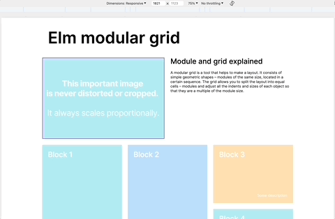
[ row [ width fill ] [ paragraph (width fill :: TextStyle.headerMobile) [ text pageTitle ] ]
, image
(scaleProportionallyToWidthOfGridSteps layout
{ originalWidth = importantImage.sourceSize.width
, originalHeight = importantImage.sourceSize.height
, widthSteps = 6
}
)
{ src = importantImage.url, description = importantImage.description }
, column [ spacing layout.grid.gutter ]
[ paragraph TextStyle.subheaderMobile [ text paragraphTitle ]
, paragraph [] [ text paragraphText ]
]
, gridRow layout
[ viewBlockMobile layout { widthSteps = 3, heightSteps = 4 } block1
, viewBlockMobile layout { widthSteps = 3, heightSteps = 4 } block2
]
, gridRow layout
[ viewBlockMobile layout { widthSteps = 4, heightSteps = 4 } block3
, viewBlockMobile layout { widthSteps = 2, heightSteps = 4 } block4
]
]
viewBlockMobile : LayoutState -> { widthSteps : Int, heightSteps : Int } -> Block -> Element msg
viewBlockMobile layout { widthSteps, heightSteps } block =
gridBox
layout
{ widthSteps = widthSteps
, heightSteps = heightSteps
}
[ Background.color block.color
, Font.color Color.white
, padding layout.grid.gutter
]
[ paragraph TextStyle.subheaderMobile [ text block.title ]
, paragraph [ alignBottom, width fill, Font.alignRight ] [ text block.description ]
]
viewDesktop : LayoutState -> Element msg
viewDesktop layout =
Debug.todo ""Here's how you can switch from a 2-screen to a 3-screen (or 1-screen) version:
- replace
GridLayout2withGridLayout3everywhere in your code - update
layoutConfig - follow compiler errors to adjust pattern matching of
ScreenClass.
